
As the Christmas Season arrives, and 2010 comes to an end, nothing more proper than a “gift” for all you awesome Inspired readers. No, I’m not making a Christmas infographic round-up this time, as perhaps some of you might expected for my monthly contribution. Instead, today I bring a selection of Infographic blogs that are not as popular as the main ones, simply because most of them are new, but nevertheless, worth following. So, I hope you enjoy this selection, and add some of these blogs to your must-read list.
Everyday Venn
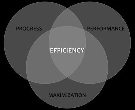
Everyday Venn is the playful expression of language and its relationships. Each day, Rebecca Rapple paints a picture of a word by characterizing it as the intersection of 2-3 other words, striving for clarity through simplicity.Some of my favorites:
Encouragement

Revenge

Efficiency
Famous Rivalries
Justin Thomas is a veteran web writer and the former managing editor of a popular humor website, where his writing and illustrations entertained over 3 million visitors every month. He also contributed to a number of other popular humor and entertainment sites over the last few years.“My original plan was to do an infographic on Thomas Edison and Nikola Tesla, because that relationship and rivalry has fascinated me for a long time, and I thought it would make a great infographic. While I was working on it, I began thinking about a whole bunch of other famous rivalries that were all fascinating in their own particular ways. There have been a lot of books, articles, and websites dedicated to specific rivalries, but there aren’t many that are dedicated to the subject of rivalries in general. I decided to start Famous Rivalries as a means of telling these fascinating stories in a quick, informative, and entertaining way.”
And we thank you, Justin!! Here’s a sample of his take on some epic rivalries:
Edison vs. Tesla

Facebook vs. Everyone

Sperm Whale vs. Giant Squid

Visualising Data
Visualising Data is a UK based data visualisation consultancy delivering collaborative design projects and knowledge transfer training programmes through the application of contemporary design theories and innovative visualisation techniques. The scope of Andy Kirk‘s blog is far reaching, showcasing best practice design, theoretically driven critiques of ineffective visualisations, deep collections and examples from major data events as well as all the latest key developments in the visualisation field.The visualisation examples displayed here represent examples of some of the visualisation makeover designs Andy has presented on his blog over the past year as well as his popular Tableau analysis work on the Wikileaks Afghanistan war logs.
Obesity prevalence graph makeover

Improving an iPhone ‘My Account’ app design

 Visualising the Wikileak’s war logs using Tableau Public
Infografiria
Considered by many as the father of infographics in Brazil, Luiz Iria has colected, during his brilliant 20-years career, over 30 Malofiej medals and several other prizes. Today, he’s the Director of the Infographics Department at Editora Abril, one of the most important in South America, and Infografiria is his personal Blog, where some of his amazing work is posted on a regular basis.Forest Monsters

Life is Amazing

Biodiversity

Paris vs New York
Vahram Muratyan went to NYC for a few weeks to get some inspiration and freshness, and soon became clear that somethings were a bit different, when comparing the Big Apple with Paris, where he worked with Elodie Chaillous under the name ViiiZ.
Paris vs New York is a visual but friendly match between those two cities seen by a lover of Paris wandering through New York’s infinite details, clichés and contradictions.
Take a look at some of this brilliant comparisons:
Tha Singers

The Stylists

The Snacks

52 Infographics in 52 Weeks
Gareth Parry is Wavelength‘s CEO, a New-Zealand based company that designs and develops custom learning solutions on any topic, and in the right mix of media for the context. Almost a year ago, Garry decided to start producing weekly infographics, with a help of his wife, facing each one of them as challenge, and covering a variety of topics.Here’s a sample of the results so far:
The New Zealand brand

Lady Gaga

Stop rubbish

Brand Pilgrim Visual Thinking
Brandpilgrim.com is a visual thinking blog, runned by Suma Mandagiri, a strategic branding consultant living in Munbai, India. She attempts to illustrate complex concepts in a simple manner.She explains: “As humans, we ideate in pictures, linkages and patterns. It is only later that we weave our seemingly disjointed impressions into a vocal framework that is presented in neat rows as evidence of our organised thinking. In the process, we sacrifice emotive expressions and sensorial engagement.”
“Brandpilgrim.com is an attempt to return us to the quirky thinking that takes the form of doodles, scribbles and caricatures on our notepads. I believe, what we classify as ‘doodle scrap’ are powerful repositories of knowledge and inspiration. Beneath the quirkiness lies an organic thought process that does not need the crutch of a long-winded explanation. And if you are like me, you respond to colours, forms and shapes with primitive glee.”
Brands Need To Have A Point Of View

Facebook ‘Like’ – Reasons To Like & Dislike

Metagraphic
Metagrafic is Javier Pérez individual brand, focused on information design, graphic design and data visualization.“I believe in the power of visual thinking and its capabilities: analisis and synthesis. The complex symplicity of good design is a perfect weapon of knowledge and this is what I offer to my clients.
Information doesn’t need artifices to emphasize. The keys of my work are good sources, typography, data illustration and good pictures. Colour is not beautiful when it doesn’t enhance data. The rest is a previous and exhaustive documentation. This must be enough to produce a motion graphic or a magazine. Of course, today we need good software engineers, too.”
Since june of 2010, Metagrafic is a partner of Itbook.es, an electronic publishing company of interactive touch books for kids. “This is my new project, together with a team of experts in videogames and marketing. Times are changing. Now, creative publishers, editors and designers make an important part of the message too.”, says Javier.
A couple of examples of Metagraphic’s work:


One More Graphic
Luis Chumpitaz is a Visual journalist with a vast experience in design and redesign of newspapers and magazines, working presently as the Information Graphic Director at Dubai Media Incorporated. One More Graphic its his personal blog, where you can find some samples of illustrations, data viz, infographics in Spanish , English and Arabic.Some of my personal favorites:
Happy Birthday, F1

Find Your perfect Valentine Gift

2010 World Cup Series

Graphadelic
Graphadelic was set up by Michael Judge, a web developer going by the name of ClickOpen, as a fun side-project to improve his design skills and explore presenting information visually. The main purpose is to inform and entertain, with easy to understand, colourful visual designs.According to Michael: “After finding inspiration from all the attractive Infographics out there, I realized that quite often the subject matter was a little dry, geeky and humourless. There’s a lot of interesting facts, world records, unusual statistics and events that can be presented. It’s fascinating trawling the web, researching and gathering data for each subject – You discover some amazing things about the world around us.
I also found that some Infographics are too large and complex to be appreciated in a web browser, so I produce smaller, bite-size graphics that fit nicely on a web page.”
And here’s a sample of Michael’s work:
Backwards Messages in Music

Sports Balls in Space

Sure, there are dozens of other interesting blogs out there, and with the rise of infographics pretty much everywhere, my guess is that we’ll keep seing new projects popping out in 2011.
I wish all of these authors the best, and may their work continue to amaze us for as long as possible!
Have any other favorite blog? Just share it with us in the comments!!
Merry Christmas everyone, and a superb 2011!!