
U&lc lives: "
1974 was the year of Watergate, an Oscar for Godfather Part II and the first issue of U&lc magazine. Now Monotype Imaging is making scans of 'the most important typographic publication of its time' available to download for free

U&lc (which stood for Upper & lower case) was published quarterly by the International Typeface Corporation until autumn 1999. Its 24-page first issue (front page shown above), under the art direction and editorship of Herb Lubalin, declared its intention to "provide a panoramic window, a showcase for the world of graphic arts – a clearing house for the international exchange of ideas and information". As well as, of course, publicising all the newest ITC typefaces.
Through its Fonts.com blog, Monotype Imaging is releasing PDF versions of the entire U&lc back catalogue, one volume per month. Anyone attending CR's Click conference last week would have received a CD with the first two on, but issues can also be downloaded here
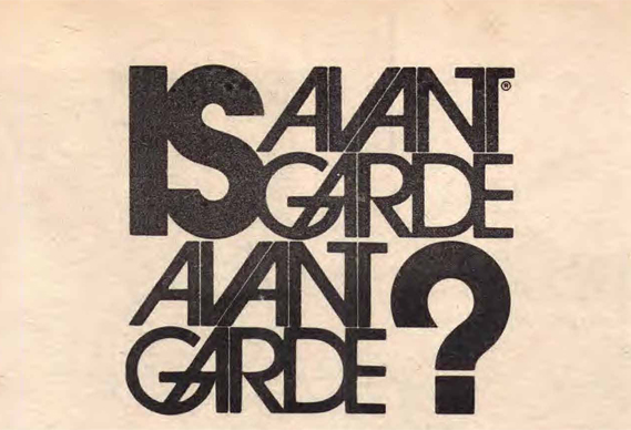
The issues are a reminder of a vibrant time for typography and illustration. In the first issue, Lubalin discusses his own much-loved Avant Garde typeface
while George Lois selects some favourite work for the (to be) regular My Best With Letters feature

and Lubalin's partner Tom Carnase reflects on the revival in interest in Spencerian lettering – no doubt he would be amused to see how popular the style, as well as many others originally featured in U&lc in the early 70s, have become with modern day typographic illustrators. "Graphic designers today," he says, "are borrowing – or reviving – traditional forms with increasing frequency to create exciting graphic images." The same piece could easily be written today.


There are plenty of gems in those early issues, including this exchange between Lubalin and the great DDB art director Helmut Krone

Much of the work, though, is quirky and very much of its time, such as this series on the ampersand in history

while there is a surprising amount of sauciness on show (perhaps not surprising given that Lubalin was the art director of Ralph Ginsburg's Eros magazine)


Sometimes, though, 1974 seems a long time ago...

But familiar themes are also explored, such as the disappearance of painted advertising signs

and this student project – an alphabet of letterforms found in nature (how often have we seen that since?)

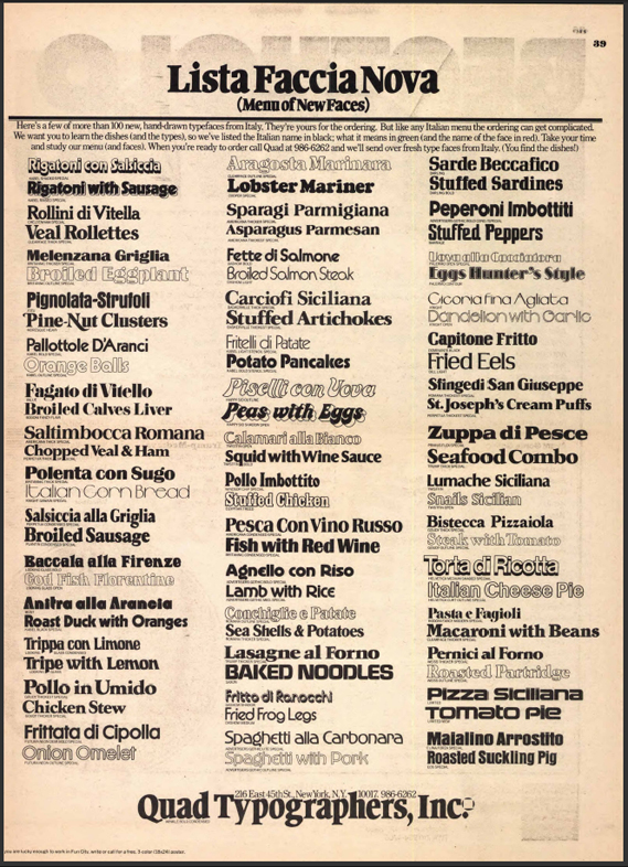
The ads too prove interesting, providing an insight into a lost world of phototypsetting and now-outmoded graphic trades


In this ad, Paul Rand even lends his illustrious name to an art supply firm


To download the issues, go here
"